The pandemic has affected many industries, disrupted more than one business plan and forced many companies to change their strategies and even the direction of their work including visual communications. Now the restrictions are gradually removed, everyone returns to the usual productive work schedule but the trend set by self-isolation will continue until at least the end of 2020. Despite the crisis their number has only increased. The designers continued to work and still delight our eyes with new and wonderful works. Specialists of the Communication agency 4D have collected the most striking cases reflecting design trends during the pandemic.
Bright colours and illustrations
Since 2018, we have seen the rise of bold and bright colours in design and today they have formed one of the most significant trends of 2020 in combination with illustrations.
For example, to enter the Chinese market Dodo Pizza tried to focus on illustrated characters in its new design. For this purpose, a new brand visual style was created for the brand in China which combined all points of contact with the brand and supported the concept of "world of amazing pizza" (current brand positioning). The main goal of the design was not just to bring millennials to the restaurant but also to break them "out of the routine of everyday life" and offer a place where they could reboot and have a little fun. It turned out quite bright!

Examples of works by Illustrator Hao Hao (郝冉) (China)
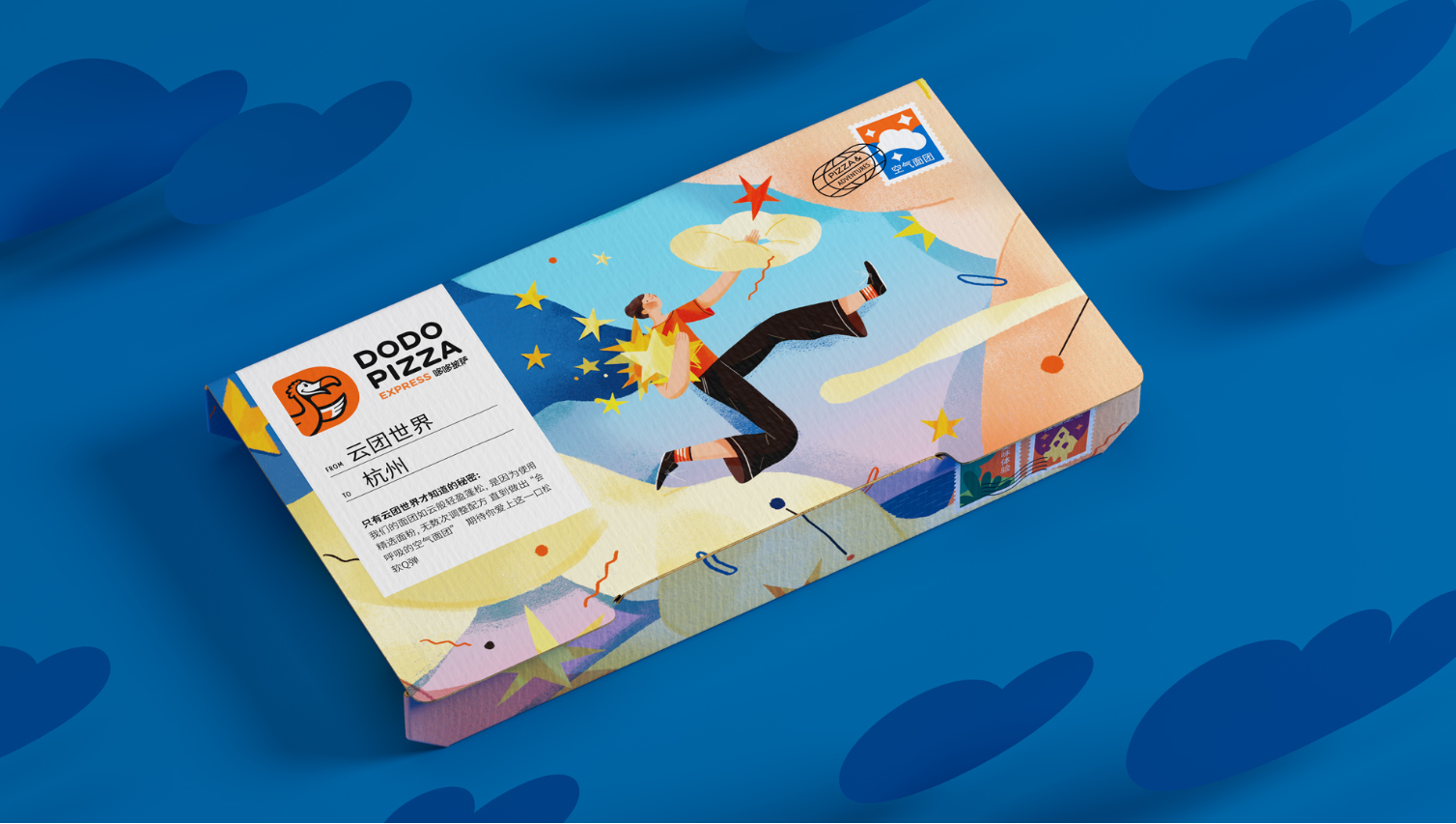
Example of a new packaging design
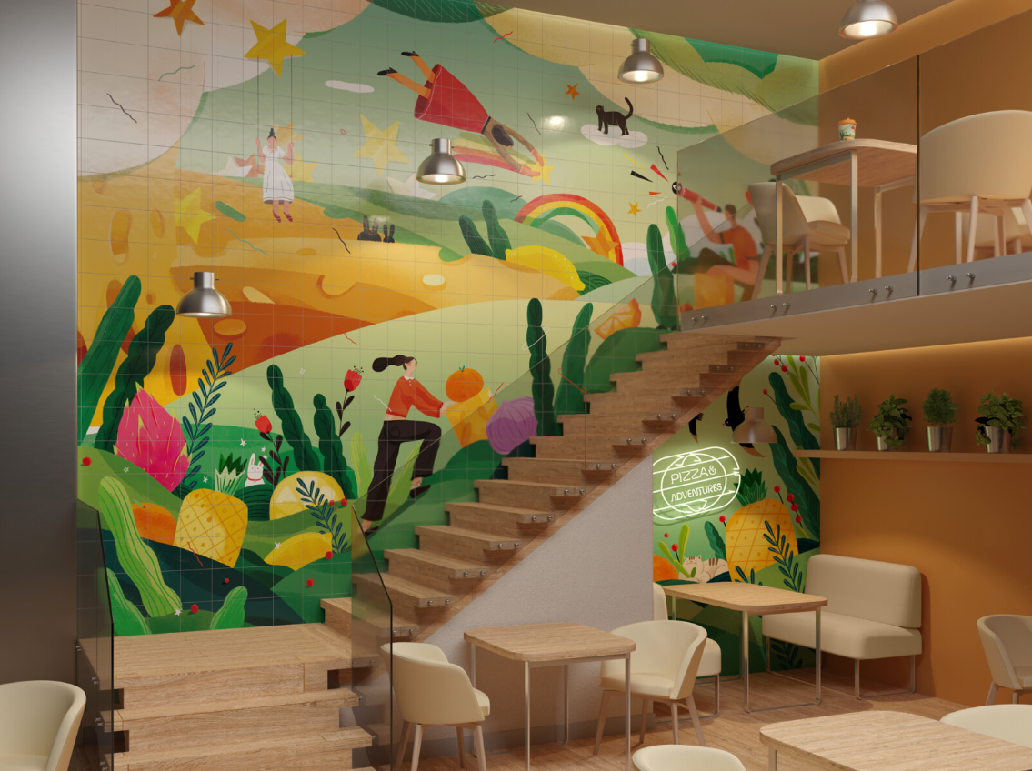
Dodo Pizza interior design in China
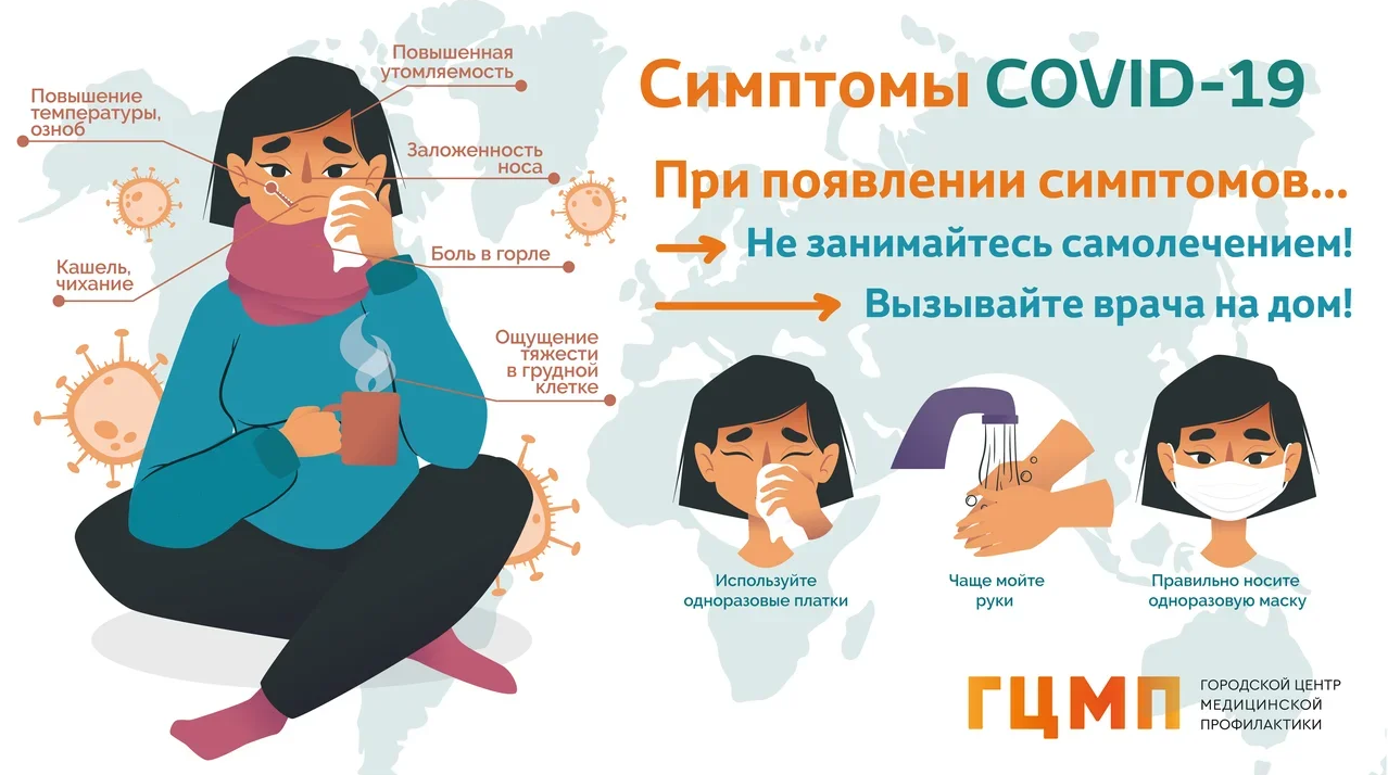
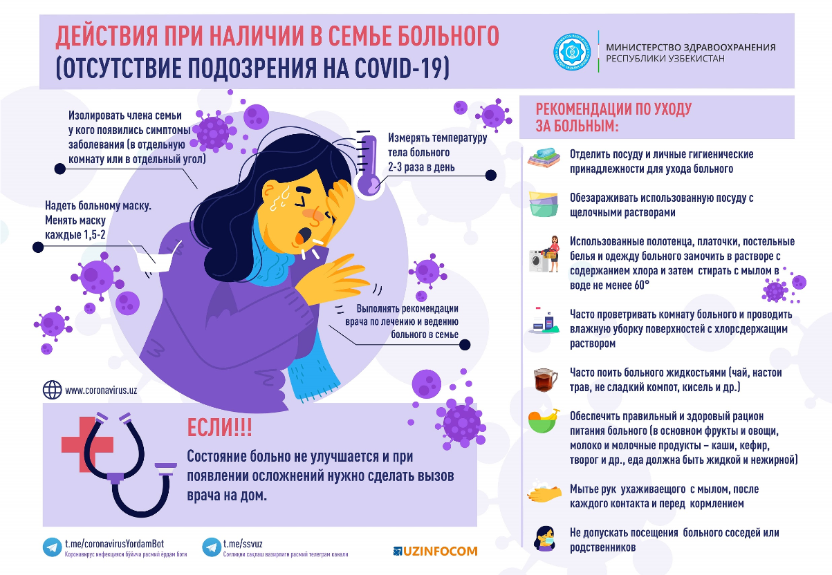
Probably many people have seen posters or other outdoor materials on the streets of their city dedicated to the precautions and symptoms of Covid-19. The Ministry of Health of the Russian Federation, GCE and others used them for illustrated characters.

Adaptive design
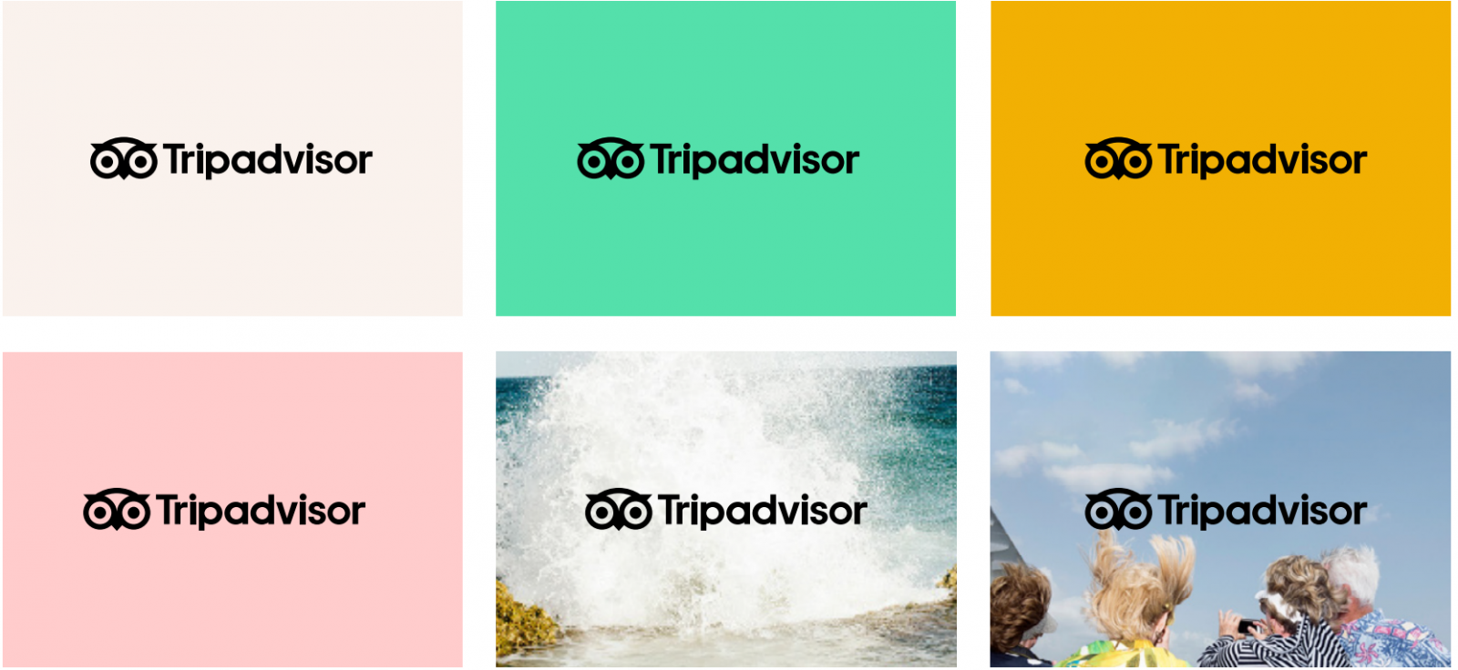
During the pandemic we have seen that in the world of "responsive" design adapting the logo to any device is extremely important. A truly responsive logo is not just reduced or enlarged on the page but can undergo additional changes and adapt to the surrounding context. Adapting the logo has become the most important task for designers: the brand must be effectively presented regardless of space and dimensions. Challenging designers, adaptive logos are becoming a must-have in 2020.
Also, 20 years later TripAdvisor decided to change its corporate logo. The new logo has retained its inherent personality, improving the geometry for better reproduction in all sizes. As a result, the owl on the logo turned out to be more simple.
3D
3D design has also remained on trend during the pandemic. Every year VKFest pleases us not only with cool performers but also with a bright design. This year the organizers decided to focus on 3D presenting everyone's favorite characters from sticker packs. It turned out quite succinctly.

Samokat express delivery service has taken one of the leading positions among consumers during the lockdown but this is not enough. You need to constantly keep your finger on the pulse and keep the attention of your customers. To do this the service has teamed up with metasearch tickets Aviasales, creating a game in which any user from July 9 to August 6, 2020 could play and get a promo code for a discount of 200 rubles for the first order and up to a maximum of 3000 rubles in a scooter. 3D design was chosen as the image for this collaboration.

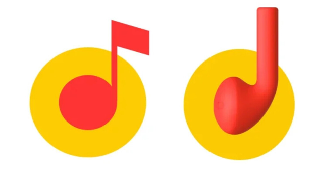
Also, service Yandex.Music did not stay away and temporarily changed the logo. Instead of a note, it has a wireless earpiece that resembles AirPods which symbolizes different audio formats. It is worth noting that in this case we see a stylized 3D object in 2D space. This allows you to build slightly more interesting compositions.
Simplicity and convenience
In 2020, a simple and user-friendly design was actively highlighted which in turn means "less is more". Simplicity implies neat elements with a light background in the best traditions of minimalism. Space is the basis of perception: when used correctly you can get a multi-functional design.
The most memorable cases during the pandemic were the updated logos of the car brands BMW, Nissan, Toyota and Volkswagen. Among the grocery stores: iGooods and Perekrestok.
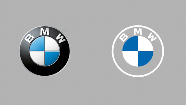
Let's start with car brands. BMW moved away from imitating metal in the logo and made a minimalistic two-dimensional sign removing the black outline of the logo but leaving the native colours of Bavaria.
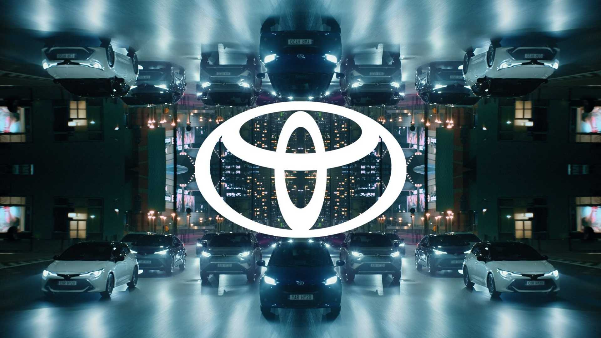
Toyota has also taken the path of simplifying the graphics. The new logo lost its postscript with the company name because the brand representatives considered it recognizable and without letters. The image itself was simplified by eliminating the 3D effect created by shadows and now the logo has a simple two-dimensional design that will be relevant for both modern cars and future developments of the company (electric cars and drones).
"We have developed a new visual design of the brand with "tomorrow" in mind. Our focus has been on providing increasingly effective customer connections enabling them to keep up with the rapid expansion of electric vehicle sales, mobile phone services and online retail. The design has been redesigned to better connect with customers through various points of contact that they can experience for the first time with the launch of the new Yaris Hybrid, the all - new fourth generation of our innovative city car," said Didier Gambar, Vice President of Sales, Marketing and Customer Service at Toyota Motor Europe.
At Nissan we also see a rejection of metal imitation in favor of a flat design. The logo retained continuity but lost the horizontal line in the center.
Volkswagen decided to change everything radically. Starting with corporate colours and ending with the appearance of a sound logo. As they say in the company this sound will replace the well-known slogan of the brand which will make the brand different and more recognizable. The rebranding not only means changing the logo but also marks the company's entry into a new era of electric mobility.

Product logos are also not inferior in changes. For example, Perekrestok also updated its brand for a reason. The occasion was the 25th anniversary of the company. The new logo also retains continuity: the clover in the sign and a similar colour scheme. However, the petals are now filled in, the font has changed and there are dots above the "e".
The logo itself has become more concise and the name reads better.

Recent years have seen the return of gradients. And this palette will add rich colours combined with a variety of textures. For example, the leading American company in the field of sound processing, recording and sound reproduction systems Dolby Labs this year also rebranded not only the logo but also the corporate identity in general. There is no doubt that the brand decided to shake up after the pandemic and play with new colours combining gradients of two or three colours.
How many more interesting rebrands and design solutions we will see during and after the final exit from the pandemic is anyone's guess but it is already clear that companies have decided to actively update in 2020 and will continue to do so.


